The 24-hour news cycle can be overwhelming. With the advent of the social media takeover, people are almost constantly exposed to breaking news alerts, bombarded with updates on current events, and deluged with an onslaught of commentary and opinions on every topic imaginable. In fact, 62% of people feel the need to always have internet access, and with that comes an endless amount of content to sift through as a consumer.
So how can marketers understand what topics and types of content truly resonate with people and act to better serve their interests accordingly?
Understanding which geographies and during what times readers interact with content can help better target their interests and purchasing behaviors with increasingly relevant, more pointed ads, thereby enhancing the user experience. We wanted to do just that and so created a tool – the VoterGraph — that would aggregate this information, making it easier to parse through on a market-by-market basis. Which topics piqued our readers’ interest, and in what ways? When?
Our customer insights from the VoterGraph show where and when readers are engaging most with news topics. This fluctuation illustrates how volatile consumer trends are.
We decided to focus on gathering data from political news topics, including immigration, healthcare and elections – subjects that speak directly to the general public’s interest. We then categorized that data by ZIP code. We classified each article over the past few years in specific topical categories, and grouped each category by ZIP code with a count of how many readers viewed articles related to that topic on a month-to-month basis.
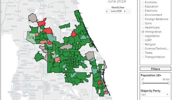
For instance, looking at immigration as our below example in Fig 1, you will notice that interest in immigration-related issues rose drastically across ZIP codes from May to June. One could hypothesize that this had to do with the influx of media attention spent addressing the topic. Our map can back that claim and delve deep into the historical trends that, month over month, demonstrate how page views shift over time.
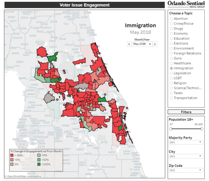
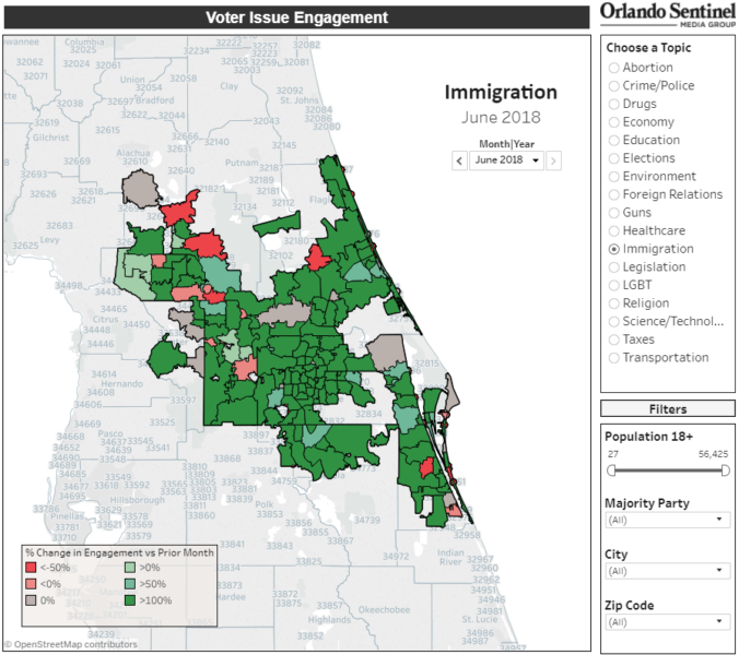
Fig 1: Measuring change in page views by topic over a designated period of time.
Furthermore, our insights allow marketers to look deeper into the trends and understand how interest differs based on ethnicity or stage-of-life. We have the ability to compare how, for instance, Hispanics and retirees engage with the Sentinel’s articles relating to immigration.
We were also curious to see how article page views varied within a ZIP code by political party. The VoterGraph highlights which political party dominates in that area, along with crucial information about voting habits and how unaffiliated voters lean.
In Fig 2, if a user hovers over a particular ZIP code, valuable information about registered voter affiliations, voting habits, and independents’ leanings appears. When marketers require a deep data dive regarding how to understand issues that resonate most with voters on a hyperlocal level, the VoterGraph fills in the gaps.
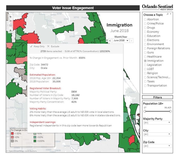
Fig 2: Investigating reader data on a ZIP code level to determine voter trends.
Taken as a whole, the VoterGraph offers a way to understand where readers are most engaging with a political issue and how those readers likely vote. It addresses a possible gap in knowledge with campaign offices and PACs, where we realized we had the capability to lend proprietary insights for their marketing strategies and break through the deluge of news with better targeting.
*Mintel, Attitudes Toward Technology and the Digital World — US — November 2017.